
Introduction
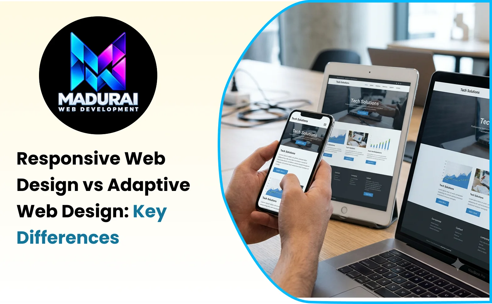
People access business websites through smartphones, tablets, laptops, desktops, and devices with different screen sizes. A website that looks excellent on a desktop monitor may become difficult to navigate on a mobile phone if its layout does not adjust properly. This makes choosing the right design approach an important part of website planning and development.
When comparing responsive vs adaptive web design, both approaches aim to deliver a suitable experience across different devices, but they achieve this in different ways. Responsive design uses flexible layouts that adjust continuously to available screen space, while adaptive design uses predefined layouts designed for selected screen sizes or device categories.
Understanding this difference helps businesses select an approach that suits their website's content, functionality, budget, and long-term maintenance requirements. Whether a company needs a service website, a corporate platform, or an ecommerce store, the right approach should make information easy to access and essential actions simple to complete.
This guide explains how responsive and adaptive web design work, compares their advantages and limitations, explores practical examples, and identifies the factors businesses should consider before making a decision.
What Is Responsive Web Design?
Responsive web design is an approach to website development in which the layout and content adapt to the available viewport width. Instead of creating an entirely separate layout for every device, developers use flexible grids, relative dimensions, responsive images, and CSS media queries to create a layout that adjusts as the screen changes.
For example, a desktop website may display three service cards in a row. On a tablet, the same cards might appear in two columns, while on a narrow smartphone screen, they may stack vertically. The layout changes according to the available space rather than relying on a single fixed arrangement.
Responsive design also considers typography, spacing, navigation, image dimensions, and interactive elements. These components should remain usable at different viewport sizes, including widths that were not specifically anticipated during development.
How Responsive Web Design Works
Responsive websites commonly use CSS techniques such as Flexbox, CSS Grid, fluid measurements, and media queries. These tools allow developers to define how elements should resize, wrap, reposition, or change appearance under different conditions.
A media query might change the number of columns displayed on a page when the viewport becomes narrower. Flexible images can scale within their containers, while relative units such as percentages, rem, and vw help layouts respond to changes in screen dimensions.
Responsive design does not mean simply shrinking a desktop page. Developers must consider how content flows, how users interact with controls, and which information deserves priority on smaller screens.
The result is a website that maintains a consistent overall experience while adjusting its presentation to suit the available space.
What Is Adaptive Web Design?
Adaptive web design uses a set of predefined layouts for selected screen sizes or device categories. Rather than continuously adjusting every element to the viewport, the website selects an appropriate layout when the visitor accesses it under a supported set of conditions.
For instance, an adaptive website might have separate layout configurations for mobile, tablet, and desktop screens. Each configuration can use different content arrangements, navigation patterns, or component dimensions to suit its intended context.
This approach gives developers more direct control over how the website appears at the selected layout sizes. It can be useful when a business has a specific design requirement for a particular device category or wants to preserve an established interface.
How Adaptive Web Design Works
Adaptive websites typically use CSS media queries and predefined layout rules, and may also use JavaScript or other logic to select particular components or experiences. The exact implementation depends on the development architecture.
For example, a desktop layout might include a large navigation menu and a multi-column content area. A mobile layout could replace the navigation with a compact menu and reorganise the page around a narrower content structure.
The important distinction is that adaptive design relies on a limited collection of planned layouts rather than a continuously fluid layout for every viewport width.
An adaptive website still needs testing between its predefined sizes. If the layouts are designed only for a few screen widths, visitors using unusual window sizes or devices may encounter awkward gaps, overflowing elements, or less comfortable content arrangements.
Responsive Web Design vs Adaptive Design: Key Differences
Although both approaches aim to improve usability across devices, their layout strategies and maintenance requirements differ.
|
Comparison factor |
Responsive web design |
Adaptive web design |
|
Layout behaviour |
Adjusts fluidly to available screen space |
Uses predefined layouts for selected screen sizes |
|
Layout structure |
Usually follows a flexible layout system |
May use distinct layout configurations |
|
Intermediate screen sizes |
Generally adapts naturally when implemented well |
Depends on how the selected layouts handle the available width |
|
Development approach |
Uses fluid grids, flexible components, and responsive rules |
Defines and maintains specific layouts or experiences |
|
Design control |
Provides flexibility across a wide range of viewports |
Offers precise control over selected layouts |
|
Maintenance |
Often easier to maintain through shared components and rules |
May require additional work when multiple layouts differ significantly |
|
Testing |
Requires testing across viewport sizes and interactions |
Requires testing across predefined layouts and the spaces between them |
|
Suitable applications |
Most general business, content, and ecommerce websites |
Projects that benefit from carefully tailored experiences for selected contexts |
Neither approach is automatically superior in every situation. The quality of the implementation, the complexity of the content, and the needs of the target audience all influence the final experience.
Responsive Website Design Benefits
Responsive design is widely used because it provides a practical way to support different screen sizes without requiring an entirely separate layout for every device category.
1. Consistent Experience Across Devices
A responsive website allows visitors to access the same core content and functionality across smartphones, tablets, laptops, and desktop computers. Its layout changes to accommodate the screen while preserving a recognisable structure.
This consistency is valuable for business websites because customers may first discover a service on their phone and later return through a desktop computer to compare options or submit an enquiry.
2. Easier Long-Term Maintenance
A well-structured responsive website can use shared templates and reusable components across different screen sizes. When the business updates a service description, changes a contact detail, or introduces a new page, the change can usually be managed within the same content structure.
This can reduce duplication and simplify ongoing development, particularly for websites with many service pages or frequently updated content.
3. Strong Foundation for SEO
Responsive design can support SEO by making the same core website content accessible across devices and simplifying URL management. Google recommends responsive web design as an implementation approach because it is generally easier to implement and maintain.
However, responsive design alone does not guarantee improved rankings. Search performance also depends on useful content, crawlability, page performance, technical configuration, internal linking, and other ranking considerations.
4. Better Support for Mobile Visitors
A responsive layout can adapt navigation, buttons, text, images, and forms to smaller screens. Visitors can browse services, read articles, compare products, and contact a business without needing to zoom in or scroll horizontally unnecessarily.
The benefits depend on how well the website is designed and tested. A responsive layout with tiny text or complicated forms can still create a poor mobile experience.
5. Flexibility for Future Devices
Responsive layouts can accommodate new viewport dimensions without requiring developers to design a completely new layout for every emerging device size. This flexibility is useful as screen dimensions and browsing habits continue to change.
Developers should still test new layouts and interactions, but a fluid layout system provides a strong foundation for future adjustments.
Advantages of Adaptive Website Design
Adaptive design offers a different set of benefits, particularly when a project requires more control over selected layouts or device-specific presentation.
1. Greater Control Over Selected Layouts
Developers can define the precise arrangement of content and components for each supported layout. This is useful when a business needs a desktop interface with complex navigation and a significantly simplified mobile experience.
Rather than relying on one flexible arrangement, each layout can be planned around the intended content hierarchy and interactions.
2. Tailored User Experiences
An adaptive website can present different component arrangements for selected contexts. For example, a booking platform may use a detailed multi-panel interface on larger screens and a simplified sequence of steps on smaller screens.
These differences can be helpful when the user journey genuinely needs to change across device categories. However, the design should remain understandable and preserve essential functionality.
3. Targeted Design Optimisation
When the target layouts are well understood, developers can optimise each one for its intended use. A desktop layout might prioritise data comparison, while a mobile layout could emphasise a primary task and reduce unnecessary interface complexity.
This level of control is useful for some specialised applications, although it requires careful planning and ongoing testing.
4. Useful for Established or Specialised Interfaces
Some legacy platforms or complex applications already depend on distinct interface structures. Adaptive design can provide a practical way to accommodate different display contexts when a complete redesign around a fluid layout would be difficult.
The decision should still consider the cost of maintaining multiple layouts and whether a responsive approach could achieve the same objective more simply.
Adaptive Website Design Examples
Practical examples make the difference between responsive and adaptive approaches easier to understand.
Example 1: A Business Service Website
Imagine a web development company that displays its services, project portfolio, client testimonials, and contact form.
With responsive design, the service cards may flow from three columns to two columns and then to one column as the viewport narrows. The navigation, typography, and spacing adjust through CSS rules, while the underlying page content remains consistent.
With adaptive design, the company may define separate desktop, tablet, and mobile layouts. Each layout could use a different navigation structure or content arrangement chosen for the relevant viewport range.
For a typical business website, responsive design is often the more straightforward choice because the same services and content need to work across a broad range of screen sizes.
Example 2: An Online Booking Platform
Consider a booking platform that allows customers to search for services, compare available options, and confirm an appointment.
A responsive implementation could rearrange the search controls and booking details into a single-column layout on smaller screens while preserving the same overall workflow.
An adaptive implementation might use a multi-panel desktop interface and a simplified, step-by-step mobile interface for the booking process. This could provide more control over the mobile journey, but the additional layout logic would need to be maintained and tested.
The right choice depends on the complexity of the interface and whether different layouts deliver a meaningful usability improvement.
Example 3: A Data-Heavy Business Dashboard
A business dashboard may display reports, charts, filters, and detailed tables. On a large screen, several data panels can appear together, making comparisons easier.
A responsive dashboard could reorganise the panels vertically and allow tables to scroll horizontally within their own containers when necessary. An adaptive dashboard could define distinct layouts for desktop and mobile, selecting which panels receive priority in each configuration.
For a complex application, a hybrid approach may be useful: responsive layout behaviour for most components, combined with carefully tailored interfaces for particular tasks.
Mobile-Friendly Website Design: What Matters Most?
A mobile-friendly website should help users complete their tasks comfortably, not merely fit the screen. Whether the website uses responsive or adaptive design, several practical considerations influence the quality of the mobile experience.
Readable Content and Appropriate Spacing
Text should remain legible without requiring visitors to zoom in. Paragraphs should be easy to scan, headings should establish a clear hierarchy, and spacing should separate different content sections.
Images must scale appropriately without becoming distorted or pushing important content outside the viewport.
Touch-Friendly Navigation
Menus, links, and buttons should be easy to select using a finger. Interactive elements placed too close together can cause accidental taps, while hidden navigation options may make important pages difficult to find.
A mobile menu should have clear labels, visible controls, and predictable behaviour.
Simple Forms and Clear Calls to Action
Mobile visitors may be completing an enquiry while travelling or using a small screen. Forms should request only the necessary information, use suitable input types, and display understandable validation messages.
Primary actions, such as contacting the business or requesting a quote, should be easy to identify without obstructing the rest of the page.
Performance and Visual Stability
Large images, unnecessary scripts, and heavy animations can make mobile browsing frustrating, particularly on slower connections. Optimising images, reducing unnecessary resources, and preventing unexpected layout shifts can improve the experience.
Google's Core Web Vitals are useful measures for evaluating loading speed, interaction responsiveness, and visual stability. They should be assessed alongside real-world usability testing rather than treated as a complete measure of website quality.
SEO Considerations for Responsive and Adaptive Websites
Both responsive and adaptive websites can support search engine optimisation when implemented correctly. The important considerations are whether search engines can access the intended content, whether the website's technical structure is consistent, and whether visitors receive a useful experience.
Responsive websites commonly use the same URL and HTML content across devices, with CSS adjusting the presentation. This generally simplifies crawling and maintenance.
Adaptive websites can also use the same URL and provide appropriate content for different screen sizes. However, implementations that deliver different HTML or content depending on the user agent require more careful testing to ensure that search engines can access the relevant content and that the mobile experience is not missing important information.
For either approach, businesses should pay attention to descriptive page titles, useful headings, internal links, image alt text, mobile content parity, structured data where appropriate, and correct canonical configuration.
Mobile-first indexing means Google primarily uses the mobile version of a website's content for indexing. Therefore, important text, links, and structured data should remain available in the mobile experience.
Neither responsive nor adaptive design automatically creates strong rankings. The website must also provide useful content, a logical architecture, reliable performance, and a good overall experience.
Responsive vs Adaptive Web Design: Which Is Better for Your Business?
For most new business websites, responsive web design is a practical starting point. It offers flexibility across viewport sizes, supports consistent content delivery, and can simplify long-term maintenance.
Small and medium-sized businesses, professional service providers, corporate websites, blogs, and many ecommerce stores can benefit from a well-planned responsive layout. These websites generally need the same core information and functionality to remain accessible across devices.
Adaptive design may be appropriate when a specialised platform requires distinctly different layouts for particular contexts, when an existing application already uses predefined interface configurations, or when research demonstrates that separate layouts provide a meaningful improvement.
Businesses should not select adaptive design merely because it sounds more advanced. Supporting multiple layouts can increase development and testing requirements, especially when the website changes frequently.
A hybrid implementation may also be appropriate. Developers can use responsive techniques for the overall page structure while tailoring specific components or workflows to improve usability on particular screens.
Before making a decision, evaluate the content structure, target audience, development resources, maintenance needs, performance requirements, and complexity of the user journey. The best approach is the one that meets these requirements without introducing unnecessary complexity.
How Madurai Web Development Can Help You Choose the Right Approach
Choosing a design approach requires more than deciding how a page should look on a smartphone. Businesses need to consider their content, brand identity, customer journey, technical requirements, search visibility, and future plans.
Madurai Web Development can be considered when exploring website design and development requirements for a new business website or an existing website improvement project. A suitable development plan should identify the required page structures, define the mobile experience, establish performance expectations, and provide a testing process before launch.
For service-based businesses, the priority may be clear service pages, convenient contact options, and mobile-friendly enquiry forms. For ecommerce or booking platforms, the focus may include product discovery, filtering, checkout usability, or task-specific interface design.
A carefully planned implementation can help ensure that the website works consistently across devices and supports the actual needs of its users.
Conclusion
Responsive and adaptive web design both aim to make websites usable across different screen sizes, but they use different layout strategies. Responsive design adjusts fluidly to available space, while adaptive design relies on predefined layouts for selected viewport sizes or contexts.
Responsive design is often the practical choice for business websites because it offers flexibility and can simplify content management and maintenance. Adaptive design remains valuable for specialised applications that benefit from more deliberate control over particular layouts or workflows.
Ultimately, the decision should be guided by customer needs rather than trends. A successful website should be accessible, easy to navigate, fast enough for its purpose, and consistent across devices. By selecting an appropriate design approach and testing it thoroughly, businesses can create a reliable digital experience that supports customer engagement and long-term growth.